With each task nailed so far, I was left with coming up with my actual portfolio, and started to think about how to make it. I checked a few resources, literal and online, and found a few good sources of information that helped loads. This one website in particular was especially inspirational...
http://www.graphicdesignblog.org/impressive-graphic-designer-portfolios/
Some of the Portfolio designs on there are insane, and as daunting as they are inspiring! Where applications for graphic jobs differ and stand aside from those for normal jobs, is that standing out in a crowd takes a whole new meaning, as different graphical engineers all fight for attention with their freshest and finest work, all their creative ideas channelled into one single portfolio, whose initial appearance can make or break their entire application.
Not all of the designs however were from individual designers, so now it seems less daunting, given that the ones for companies will no doubt have had a team of experts working together to form the look and style, as well as making up the varied bulk of incredible work within.
As I'm nowhere near that level, I can't hope to compete with some of the examples on offer. BUT, that should no way mean I should sell myself short, and still have to put my every effort into my application like I would if I was on the same level already.
Some of the examples that really stood out for me are as follows..
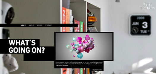
FORM TROOPERS
What I like about this one is how organised it comes across as being, yet in a unique and stylistic way. You can see how it would run throughout, with a certain sophisticated yet urban elegance that no doubt reflects it's designers style well.
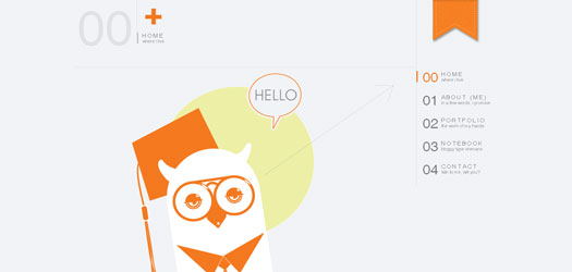
JOE NYAGGAH
Basic in initial appearance, but no doubt filled to the brim with content. I love how it's simplicity belies its novel appeal, and instantly shows you the designer's individual style and most favoured art form. Strong yet not overwhelming colour scheme. Elegant.
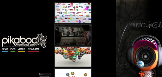
PIKABOO
Very cool and colour co-ordinated, with simple and highly effective layout and treatment. Has urban undertones yet an impressively high end digital feel to it, gives an insight into the type of work the company does.
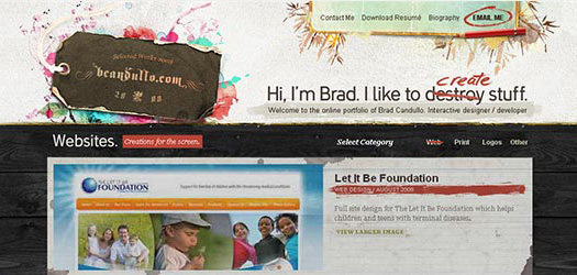
BRAD CANDULLO
Love how original and unique this looks, catches the eye before you even read a word. I also like the designer's way off injecting his own personality into his portfolio, with a little bit of humour. I bet with countless applications arriving day by day, employers can easily grow a little bored looking at the same old stuff, so when one comes along like this that has a little character, it makes a refreshing change, and stands out in a positive light because of it. Which can only be a good thing for a potential job interview!
I'll look at a few more designs before finally putting pen to paper and fleshing out some ideas, but so far this has been a great look at a few stellar pieces, all of which have helped me see where to aim for now.



No comments:
Post a Comment